n
0
Exploratory Data Analysis For Epidemiology
lm(), interpret its coefficients, confidence intervals, R² and F-test, and check its assumptions with diagnostic plots and formal tests.glm(family = binomial), interpret its odds ratios and predicted probabilities, and check its events per coefficient, calibration and discrimination.This course was developed by Dr. Kiffer G. Card, Faculty of Health Sciences, Simon Fraser University based on Dohoo, I. R., Martin, S. W., & Stryhn, H. (2012). Methods in Epidemiologic Research. VER Inc.
📚 Reference page, available throughout the lesson
This glossary collects the key concepts, methods and people in this lesson. It can be used as a reference while working through the material or as a review before assessments. Typing in the search box filters the entries.
lm().
predict(model, newdata, type = "response").
age:smoker, together with both main effects.
lm().
plot(model) draws four diagnostic plots: residuals versus fitted values, a Q-Q plot of the residuals, a scale-location plot and residuals versus leverage.
bptest()) checks equal variance, and the Shapiro-Wilk test (shapiro.test()) checks normality of the residuals. Both become very sensitive in large samples.
coeftest(model, vcov = vcovHC(model, type = "HC3")).
glm(..., family = binomial).
This section begins with the familiar tests that compare two variables at a time and then introduces regression as the method that compares many variables at once. All of the examples use phaa_survey_clean.csv, the cleaned PHAA survey of 800 adults from Lesson 2, with systolic blood pressure as the main outcome.
A two-variable test asks whether two variables are associated. The choice of test depends on the type of each variable, which Lesson 2 described as numeric (continuous or discrete) or categorical (binary, nominal or ordinal). The table below lists the four tests used most often in this course.
| Outcome | Predictor | Test and R function | Example in the PHAA data | Result |
|---|---|---|---|---|
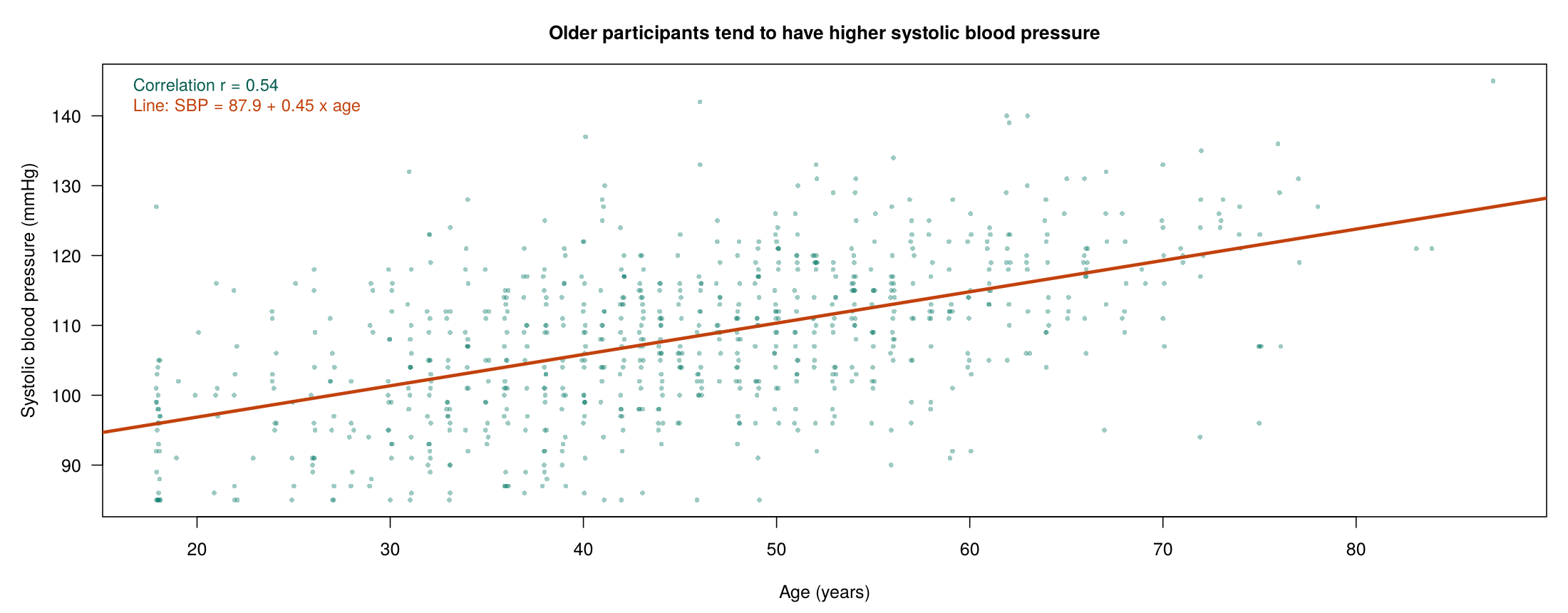
| Numeric | Numeric | Pearson correlation, cor.test() | Systolic BP and age | r = 0.54 (95% CI 0.49 to 0.59), p < 0.001 |
| Numeric | Two groups | Two-sample t-test, t.test() | Systolic BP by smoking | Difference 6.3 mmHg (4.2 to 8.4), p < 0.001 |
| Numeric | Three or more groups | One-way ANOVA, aov() | Systolic BP by region | F = 1.74 on 4 and 793 df, p = 0.14 |
| Categorical | Categorical | Chi-square test, chisq.test() | Elevated BP by smoking | 12.1% against 35.6%, χ² = 44.2, p < 0.001 |
Each test has its own assumptions. The correlation coefficient measures a straight-line relationship. The t-test and ANOVA assume roughly normal outcomes within each group (or reasonably large groups), and the classic versions assume similar spread in each group; R's default t.test() uses the Welch version, which does not require equal spread, and var.equal = TRUE requests the classic version used in this section. The chi-square test needs an expected count of about 5 or more in each cell of the table. When these assumptions are doubtful, a rank-based or exact version of the test is used instead, as the box below the next example shows.
The chi-square test needs two categorical variables, so systolic blood pressure is recoded as elevated (120 mmHg or more) or not. In R this takes one line, phaa$elevated_bp <- factor(ifelse(phaa$systolic_bp >= 120, "Yes", "No"), levels = c("No", "Yes")), which gives 128 people with elevated blood pressure and 670 without (2 readings are missing). Recoding a continuous variable throws away information, because a reading of 121 and a reading of 145 become the same category, so it is done only when a yes-or-no outcome answers the question being asked. The survey's own hypertension variable has only 23 cases, too few for the multivariable models in Section 3, which is why this lesson uses elevated blood pressure as its yes-or-no outcome.
Many of the familiar two-variable tests are special cases of the general linear model, the family that includes linear regression and analysis of variance, so the regression models of this lesson can carry out the same comparisons. The simpler tests nonetheless remain in wide use. They are the conventional way to report crude comparisons, such as the group differences in a descriptive “Table 1”, where no adjustment is intended. They are familiar to readers, report the comparison directly in the units of the question, and require fewer modelling decisions, and their rank-based and exact versions accommodate skewed distributions, ordinal scales, and small samples. A rank-based (non-parametric) test replaces each value with its position in the sorted data, so a few extreme values carry little weight, and an exact test calculates its p-value directly from every possible arrangement of the data, so it remains accurate in small samples.
The table lists the basic tests, the R function that runs each one, and the regression model that returns the same or a closely related result. Where a rank-based test is listed, it is chosen because of the shape of the distribution or the measurement scale, and Lesson 2 describes how to judge whether a distribution is close enough to normal.
| Test | Compares | R function (example) | Regression counterpart |
|---|---|---|---|
| Pearson correlation | Linear association between two continuous variables | cor.test(x, y) | lm(y ~ x); the slope test gives the same t and p-value |
| Spearman’s ρ (rank-based) | Monotonic association when either variable is skewed or ordinal | cor.test(x, y, method = "spearman") | The same coefficient as a Pearson correlation of the ranks, cor(rank(x), rank(y)) |
| Two-sample t-test | Means of a continuous outcome in two independent groups | t.test(y ~ group) | lm(y ~ group); the same p-value as t.test(y ~ group, var.equal = TRUE), with the sign of t reversed (R’s default Welch test differs slightly) |
| Paired t-test | The mean within-pair difference, as in before-and-after measurements | t.test(after, before, paired = TRUE) | lm(I(after - before) ~ 1); the intercept test is identical |
| Mann–Whitney U (Wilcoxon rank-sum, rank-based) | Two independent groups when the outcome is skewed or ordinal | wilcox.test(y ~ group) | Closely approximated by lm(rank(y) ~ group) |
| Wilcoxon signed-rank (rank-based) | Within-pair differences that are skewed or ordinal | wilcox.test( | Closely approximated by an intercept-only regression on the signed ranks of the differences |
| One-way ANOVA | Means of a continuous outcome across three or more groups | summary(aov(y ~ group)) | lm(y ~ group); the same F-test |
| Kruskal–Wallis (rank-based) | Three or more groups when the outcome is skewed or ordinal | kruskal.test(y ~ group) | Computed from a one-way ANOVA on the ranks, lm(rank(y) ~ group) |
| Pearson χ² | Association between two categorical variables | chisq.test( | glm(y ~ x, family = binomial); for a 2 × 2 table its score test, anova(fit, test = "Rao"), equals χ² computed with correct = FALSE, that is, without the continuity correction, a small adjustment that R applies to 2 × 2 tables by default |
| Fisher’s exact test (exact) | A 2 × 2 table with small expected counts | fisher.test( | Exact logistic regression, a version of logistic regression for small samples that this course does not develop |
| McNemar’s test | Paired binary outcomes, as in matched pairs or before-and-after measurements | mcnemar.test( | Conditional logistic regression, a version of logistic regression for matched data that this course does not develop; its score test equals McNemar’s χ² computed with correct = FALSE |
| Cochran–Armitage trend test | A binary outcome across ordered categories | prop.trend.test( | glm(y ~ score, family = binomial); its score test is the same statistic |
| Log-rank test | Survival curves in two or more groups | survival:: | Cox proportional hazards regression, survival::; its score test is the log-rank test when no event times are tied |
A two-variable test compares people who differ in the predictor, but those people may also differ in many other ways. When a third variable is related to both the predictor and the outcome, it can create, hide or exaggerate an association. Such a variable is called a confounder.
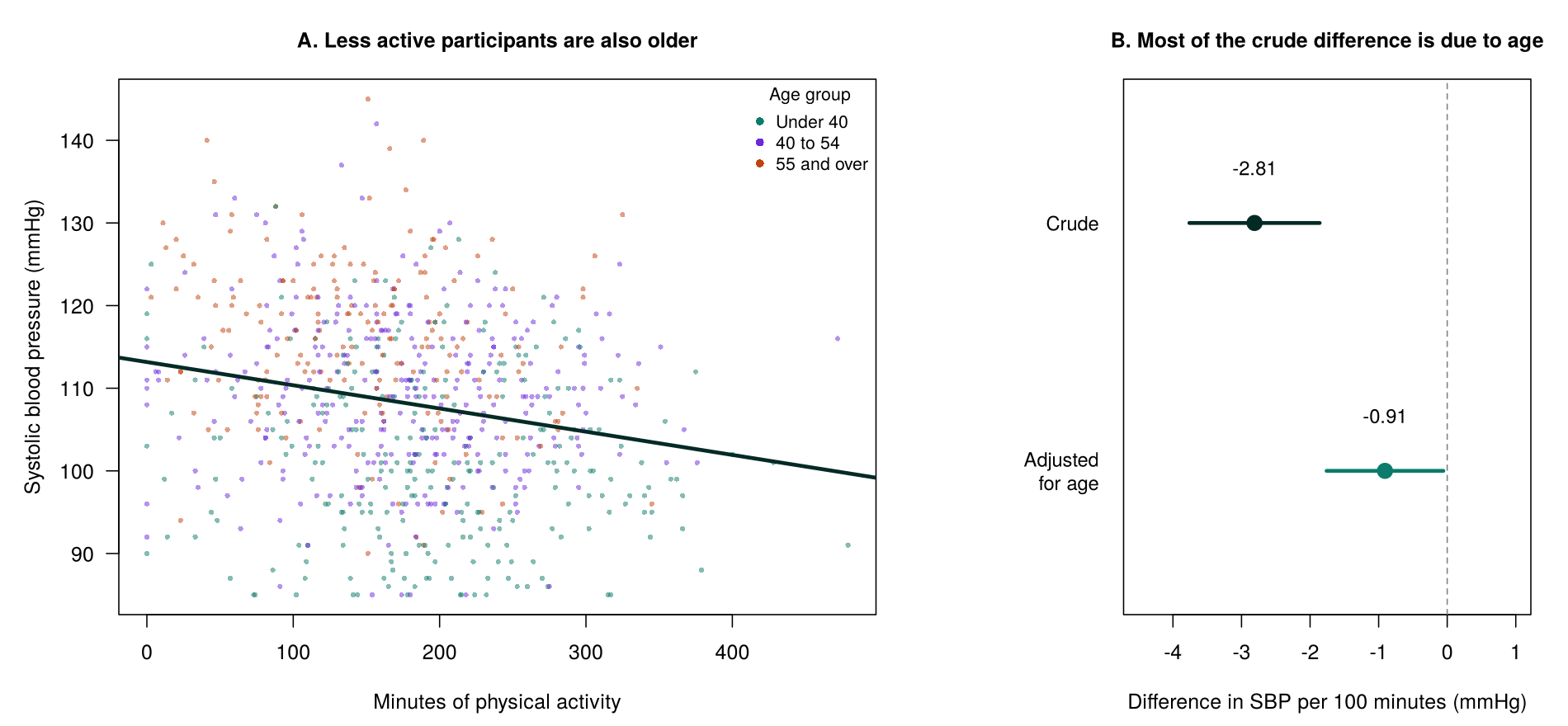
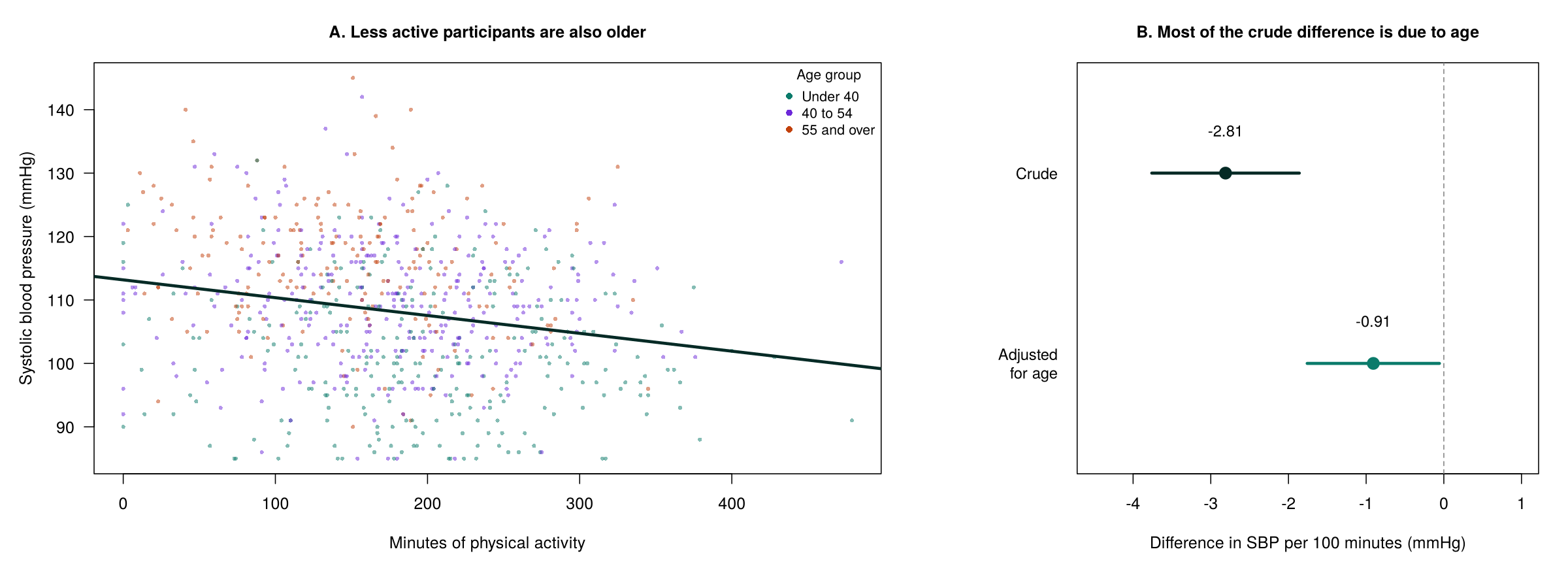
Among the 768 participants with blood pressure, age and physical activity recorded, each additional 100 minutes of activity is associated with a systolic blood pressure 2.81 mmHg lower (95% CI 1.86 to 3.76 mmHg lower). Activity and age are negatively correlated (r = −0.27), and blood pressure rises by about 0.43 mmHg per year of age. When age is added to the model, the difference per 100 minutes falls to 0.91 mmHg (95% CI 0.06 to 1.76 mmHg lower, p = 0.037), a reduction of about two thirds. Most of the crude association reflects the fact that the more active participants are younger.
Linear regression describes how the average of a continuous outcome changes with one or more predictors. With one predictor, it fits a straight line.
The fitted line for age is SBP = 87.9 + 0.45 × age. The intercept, 87.9 mmHg, is the predicted value at age 0, which is outside the data and has no practical meaning here; it fixes the height of the line. The slope, 0.45 mmHg per year, is the quantity of interest. The residual for each person is the observed blood pressure minus the value on the line, and ordinary least squares (OLS) chooses the intercept and slope that make the sum of the squared residuals as small as possible.
Click anywhere on the chart to add a point. Click on an existing point to remove it. The least-squares line, residuals, R², and standard error of the slope update live. Hovering over, or tapping, any label below the chart shows a plain-language definition of that number. Add an extreme outlier and watch one observation pull the line (Cook, 1977; Belsley, Kuh, & Welsch, 1980).
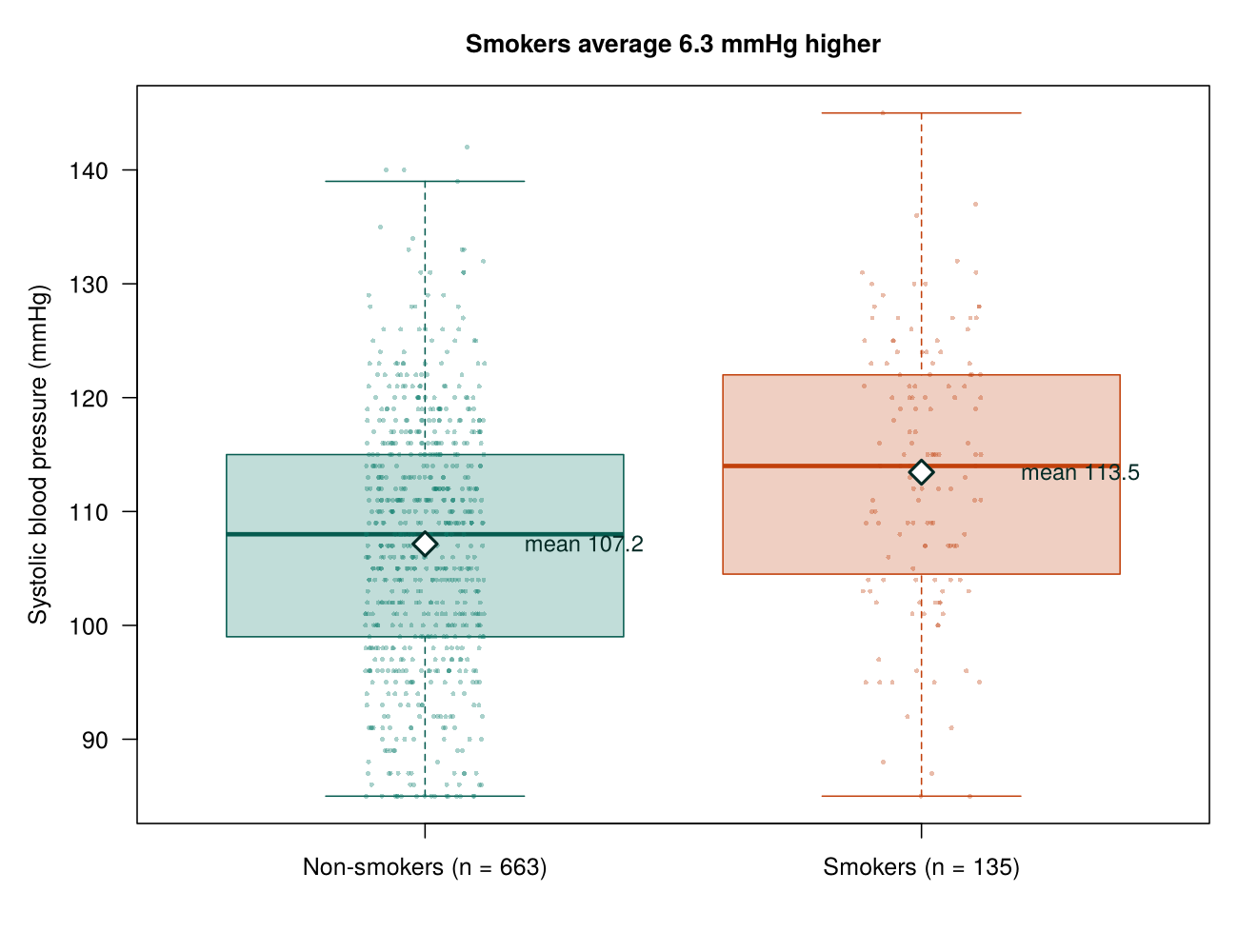
A regression with a single binary predictor reproduces the t-test. In lm(systolic_bp ~ smoker), the intercept (107.16 mmHg) is the mean for non-smokers, the reference group, and the slope for smokerYes (6.30 mmHg) is the difference between the two means. Its t statistic (6.01) and p-value (2.9 × 10⁻⁹) match those of t.test(..., var.equal = TRUE) exactly. A regression with a categorical predictor of three or more groups reproduces the one-way ANOVA, and the F-test printed at the bottom of its summary() is the ANOVA F-test. With one numeric predictor, the slope equals the correlation multiplied by the ratio of the standard deviations of the outcome and the predictor, and the R² of the regression equals the squared correlation (0.54² = 0.29 for age).
A multivariable regression includes several predictors. Each coefficient then describes the change in the average outcome for a one-unit change in its predictor among people with the same values of the other predictors. In the physical activity example, the coefficient of −0.0091 mmHg per minute in the model with age compares people of the same age. This property, adjustment for the other variables in the model, is the main reason regression is used in epidemiology.
In observational studies, incorporating more than one predictor almost always leads to a more complete understanding of how the outcome varies, and it decreases the chance that the regression coefficients for exposures of interest are biased by confounding variables. A confounding variable that is included in the equation is adjusted for and therefore cannot bias the βs. A confounding variable that is omitted from the equation can still bias them, that is, push them systematically away from the true values, which is why the choice of variables to include matters.
Intervening variables lie on the causal path between the exposure and the outcome; weight gain, for example, may lie on the path from physical inactivity to high blood pressure. Provided the model contains no intervening variables and no variables that are themselves effects of the outcome, no variable in the regression equation confounds the βs. If intervening variables are included, the coefficient for the exposure no longer estimates its total causal effect, because part of that effect travels through the intervening variable and is removed by the adjustment. The possibility that an important confounder was never measured, and was therefore omitted from the model, can never be ruled out completely.
A major trade-off in model building is to include the necessary confounding variables while leaving out variables of little importance. Including too many unimportant variables increases the number of βs estimated and may lead to poor performance of the equation on future datasets. Also, having to measure unnecessary variables increases the cost of future work.
A multivariable model has one outcome and several predictors. A multivariate model has several outcomes analysed together. The models in this course are multivariable.
This activity runs the four tests in the table above on the PHAA survey.
phaa <- read.csv("phaa_survey_clean.csv")   # file must be in the working directory
phaa$smoker <- factor(phaa$smoker, levels = c("No", "Yes"))              # "No" = reference
phaa$gender <- factor(phaa$gender, levels = c("Man", "Woman", "Non-binary"))   # "Man" = reference
cor.test(phaa$age, phaa$systolic_bp) # correlation: two numeric variablesThe correlation is 0.54 (95% CI 0.49 to 0.59) for the 796 people with both measurements (df = 794 is n − 2).
t.test(systolic_bp ~ smoker, data = phaa, var.equal = TRUE) # t-test: two group meansThe means are 107.16 mmHg for non-smokers and 113.45 mmHg for smokers. Calculated from the unrounded means, the difference is 6.30 mmHg, so smokers average 6.30 mmHg higher.
round(tapply(phaa$systolic_bp, phaa$region, mean, na.rm = TRUE), 1)   # mean by region
summary(aov(systolic_bp ~ region, data = phaa)) # ANOVA: three or more meansThe Pr(>F) column gives the ANOVA p-value of 0.139.
phaa$elevated_bp <- factor(ifelse(phaa$systolic_bp >= 120, "Yes", "No"),
                           levels = c("No", "Yes"))   # "Yes" (120 mmHg or more) is the event
tab <- table(phaa$smoker, phaa$elevated_bp)
tab                                            # counts
round(prop.table(tab, margin = 1), 3)          # share with elevated BP in each smoking group
chisq.test(tab) # chi-square test: two categorical variablesThe rows of prop.table() give the share with elevated blood pressure in each smoking group. R applies Yates' continuity correction to a two-by-two table by default.
Use the questions below to interpret the output you produced. Look at your console output before answering.
1. Report the correlation between age and systolic blood pressure with its 95% confidence interval, and describe its strength and direction in one sentence.
2. Report the difference in mean systolic blood pressure between smokers and non-smokers with its 95% confidence interval and p-value, and explain what the p-value means.
3. Which test did you use for region, and what do you conclude? Which test did you use for smoking and elevated blood pressure, and what do you conclude?
This activity shows that a regression with one binary predictor reproduces the t-test, and then adds age to the physical activity model.
phaa <- read.csv("phaa_survey_clean.csv")   # file must be in the working directory
phaa$smoker <- factor(phaa$smoker, levels = c("No", "Yes"))              # "No" = reference
phaa$gender <- factor(phaa$gender, levels = c("Man", "Woman", "Non-binary"))   # "Man" = reference
fit_smk <- lm(systolic_bp ~ smoker, data = phaa)   # regression with one binary predictor
summary(fit_smk)$coefficientsThe intercept is the mean for non-smokers (107.16 mmHg) and the smokerYes slope is the difference between smokers and non-smokers (6.30 mmHg), with the same t value and p-value as the t-test in the previous activity.
act <- na.omit(phaa[, c("systolic_bp", "phys_act_min", "age")])   # same people in both models
crude <- lm(systolic_bp ~ phys_act_min, data = act)            # physical activity alone
adjusted <- lm(systolic_bp ~ phys_act_min + age, data = act)   # adding age
round(summary(crude)$coefficients, 4)
round(summary(adjusted)$coefficients, 4)100 * coef(crude)[["phys_act_min"]] # difference per 100 minutes, crude
100 * coef(adjusted)[["phys_act_min"]] # difference per 100 minutes, adjusted for ageBoth models use the same 768 people, so the change in the coefficient reflects the adjustment for age alone.
Use the questions below to interpret the output you produced. Look at your console output before answering.
1. Compare the smokerYes estimate, t value and p-value from lm() with the t-test from the previous activity. What does the comparison show?
2. Report the difference in systolic blood pressure per 100 minutes of physical activity before and after adjusting for age. By how much does it change?
3. Explain in two sentences why the coefficient changes, using the word confounder.
1. What type of outcome variable is linear regression most suitable for?
2. A study compares length of hospital stay, which is strongly right-skewed, between patients of two independent hospitals. Which test is most suitable?
3. In the equation Y = β0 + β1X1 + ε, what does β1 represent?
4. The crude association between physical activity and blood pressure shrinks by two thirds after adjusting for age. What does this suggest?
5. What is the key advantage of a multivariable regression model over a simple regression model?
This section showed that a two-variable comparison can be distorted by confounding, and that a multivariable regression adjusts each coefficient for the other predictors in the model. A confounder is a variable that affects both the exposure of interest and the outcome and comes before the exposure, whereas an intervening (mediating) variable lies on the causal pathway from the exposure to the outcome. Think of a continuous outcome in your field of interest and an exposure that might affect it. Which variables would you include in a regression model, and how would you decide which of them are confounders (to be adjusted for) and which are intervening variables (to be left out when the total effect of the exposure is of interest)?
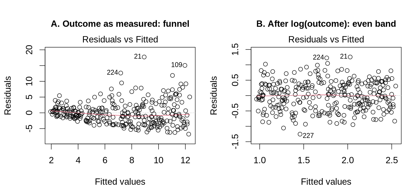
This section fits a multivariable linear regression for systolic blood pressure, reads its output, checks its assumptions, and describes what to do when an assumption fails. The model has five predictors (age, gender, smoking, BMI and the depression score) and uses the 795 PHAA participants with complete data for these variables.
lm() and interpret its coefficients, confidence intervals and p-values.The model is written in R as lm(systolic_bp ~ age + gender + smoker + bmi + dep_score, data = cc), where cc holds the complete cases. The table interprets each coefficient. Every estimate is adjusted for the other predictors in the model.
| Predictor | Estimate (mmHg) | 95% CI | Interpretation |
|---|---|---|---|
| Intercept | 71.14 | 66.59 to 75.69 | The predicted value for a non-smoking man aged 0 with a BMI and depression score of 0, which is outside the data and has no practical meaning. |
| Age | 0.43 | 0.38 to 0.47 | Each additional year of age is associated with a systolic BP 0.43 mmHg higher (4.3 mmHg per decade). |
| Woman vs man | −0.34 | −1.58 to 0.90 | Women average 0.34 mmHg lower than men; the interval includes 0. |
| Non-binary vs man | −0.61 | −4.03 to 2.81 | The wide interval reflects the small group of 27 non-binary participants. |
| Smoker vs non-smoker | 6.15 | 4.49 to 7.80 | Smokers average 6.15 mmHg higher than non-smokers with the same age, gender, BMI and depression score. |
| BMI | 0.43 | 0.23 to 0.63 | Each additional unit of BMI is associated with a systolic BP 0.43 mmHg higher. |
| Depression score | 0.38 | 0.30 to 0.46 | Each additional point on the depression score is associated with a systolic BP 0.38 mmHg higher. |
The smoking estimate in this model (6.15 mmHg) is close to the unadjusted difference of 6.30 mmHg from Section 1, but Section 4 shows that this similarity hides two changes in opposite directions: adjustment for the confounders lowers the estimate, and adjustment for BMI, a mediator, raises it.
Each row of the summary() output gives a t-test of whether that coefficient differs from zero, computed as the estimate divided by its standard error. The 95% confidence interval, from confint(), is approximately the estimate plus or minus 1.96 standard errors. The bottom of the output describes the whole model: R² is the share of the variation in the outcome explained by the predictors (0.414), the adjusted R² applies a penalty for the number of predictors (0.409), the residual standard error is the typical size of a residual (8.70 mmHg), and the F-test asks whether the predictors together explain more variation than chance (F = 92.7 on 6 and 788 degrees of freedom, p < 0.001).
Two sources of uncertainty stack when you use a fitted model to predict. The first is uncertainty about where the regression line itself sits, captured by the usual standard error. The second is the natural scatter of an individual observation around that line. A confidence interval for the mean of Y at a chosen value x* (a particular value of the predictor, such as an age of 50) uses only the first source: Ŷ ± t0.025·SE, where t0.025 is the critical t value that leaves 2.5% of the t distribution in each tail (about 1.96 in large samples). A prediction interval for a single new individual adds the second source, so it is always wider than the confidence interval. Both intervals widen as x* moves further from the mean of X1, because the line is pinned down most tightly near the centre of the data.
R² (the coefficient of determination) describes the amount of variance in the outcome “explained” by the predictor variables. One formula: R² = SSM/SST = 1 − (SSE/SST). Unfortunately, R² always increases as variables are added to the model. The adjusted R² = 1 − (MSE/MST) adjusts for the number of predictors and is useful for comparing models with different numbers of variables.
Sometimes it is necessary to simultaneously evaluate the significance of a group of X-variables (e.g., a set of indicator variables for a nominal variable). The SSE of the full model is compared with the SSE of the reduced model (without the group) using a partial F-test, which shows whether the set of variables as a group contributes significantly to the model.
The F-test has a straightforward interpretation only in a controlled experiment, where the investigators set the values of the X-variables themselves, for example by assigning treatments. In observational studies, where the X-variables are measured as they occur, the F-statistic also depends on how many candidate variables were available, how strongly they are correlated with one another, the total number of subjects, and the method used to choose which variables to keep (variable selection). Most variable selection methods keep the combination of variables that makes F largest, so the observed F overstates the significance that the model would show in a new sample.
The simulator below runs many imaginary studies with a chosen true effect and sample size. It shows that p-values vary from one study to the next, that they are spread evenly between 0 and 1 when there is no true effect, and that a larger sample makes a real effect easier to detect. A p-value should therefore be read together with the estimate and its confidence interval.
Run hundreds of simulated studies. Each study fits a regression of Y on X with a chosen true effect and sample size. Watch the distribution of p-values build up. With no real effect, p-values are uniform on [0,1], meaning that every value between 0 and 1 is equally likely. With a real effect, p-values pile up near zero. Power, the chance that a study detects an effect that is really present, equals the proportion of p-values below α, the significance threshold (usually 0.05).
A scatter of n points; black line = OLS fit; t-statistic and p-value displayed.
Histogram of all p-values run so far. Red region = p < α (significant).
The t-tests, confidence intervals and F-test above are trustworthy only when the model's assumptions hold. The four main assumptions are summarised by the word LINE, and two further checks are usually added.
| Assumption | What it means | How to check it | Result for this model |
|---|---|---|---|
| Linearity | The average outcome changes in a straight line with each continuous predictor. | Residuals vs Fitted plot; add a squared term and compare models. | Flat smoother; squared age term p = 0.51. |
| Independence | Each observation is unrelated to the others. | Judged from the study design. | One survey row per person. |
| Normality | The residuals are roughly normally distributed. | Q-Q plot; shapiro.test(). | Points on the line; p = 0.62. |
| Equal variance | The residuals have the same spread at every fitted value. | Scale-Location plot; bptest(). | Flat line; p = 0.58. |
| No undue influence | No single observation changes the results much. | Residuals vs Leverage plot; Cook's distance. | Largest Cook's distance 0.061. |
| No strong collinearity | The predictors are not too strongly correlated with each other. | vif(). | All values below 1.12. |
Calling plot() on a fitted lm object in R produces four panels, each of which addresses one or more of the assumptions above. The table describes what each panel shows and how a problem appears in it.
| Panel | What it plots | What an adequate model shows | What a problem looks like |
|---|---|---|---|
| Residuals vs Fitted | Raw residuals against fitted values, with a smoothed trend line | A horizontal band of points centred on zero, with the smoothed line close to flat | A systematic curve indicates a misspecified functional form; a band that widens from left to right indicates non-constant variance |
| Q-Q Residuals | Standardised residuals against the quantiles expected under normality | Points lying close to the diagonal reference line | An S-shaped pattern indicates tails heavier or lighter than normal, meaning more or fewer extreme residuals than a normal distribution would produce; a bend at one end indicates skew; isolated points at either end indicate outliers |
| Scale-Location | The square root of the absolute standardised residuals against fitted values | A flat smoothed line with even vertical scatter | A rising or falling smoothed line, which is the clearest visual signal of non-constant variance |
| Residuals vs Leverage | Standardised residuals against leverage, with dashed contours of Cook’s distance at 0.5 and 1 | All points well inside the contours; in a well-behaved model the contours often fall outside the plotted region altogether | Points beyond a contour, whose removal would move one or more coefficients appreciably |
The panels are read together. A funnel in the first panel that reappears as a rising line in the third is strong evidence of non-constant variance, whereas a single stray point that appears in the second panel and again in the fourth points to influence, and the distributional assumption may still hold for the remaining observations. R labels the three most extreme observations in each panel by row name, which makes it straightforward to inspect those rows directly.
The four panels share a vocabulary. A fitted value is the model's prediction for an observation, and a residual is the observed outcome minus the fitted value. A standardised residual is a residual divided by its estimated standard deviation, so that values beyond about ±2 are unusual and values beyond ±3 are rare. The red line in three of the panels is a smoother that follows the average pattern of the points, and the numbers printed beside a few points are row names, which identify the observations R considers most extreme in that panel.
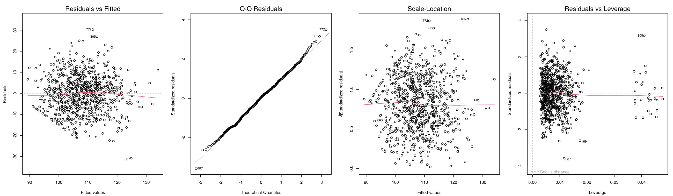
The first figure shows the four panels R produces for the blood pressure model in this section. All four look as an adequate model should. The figures that follow place a simulated adequate panel beside simulated problem panels so that each pattern can be recognised; the R box at the end of this subsection contains the R code that generates the simulated data, so the pictures can be reproduced.
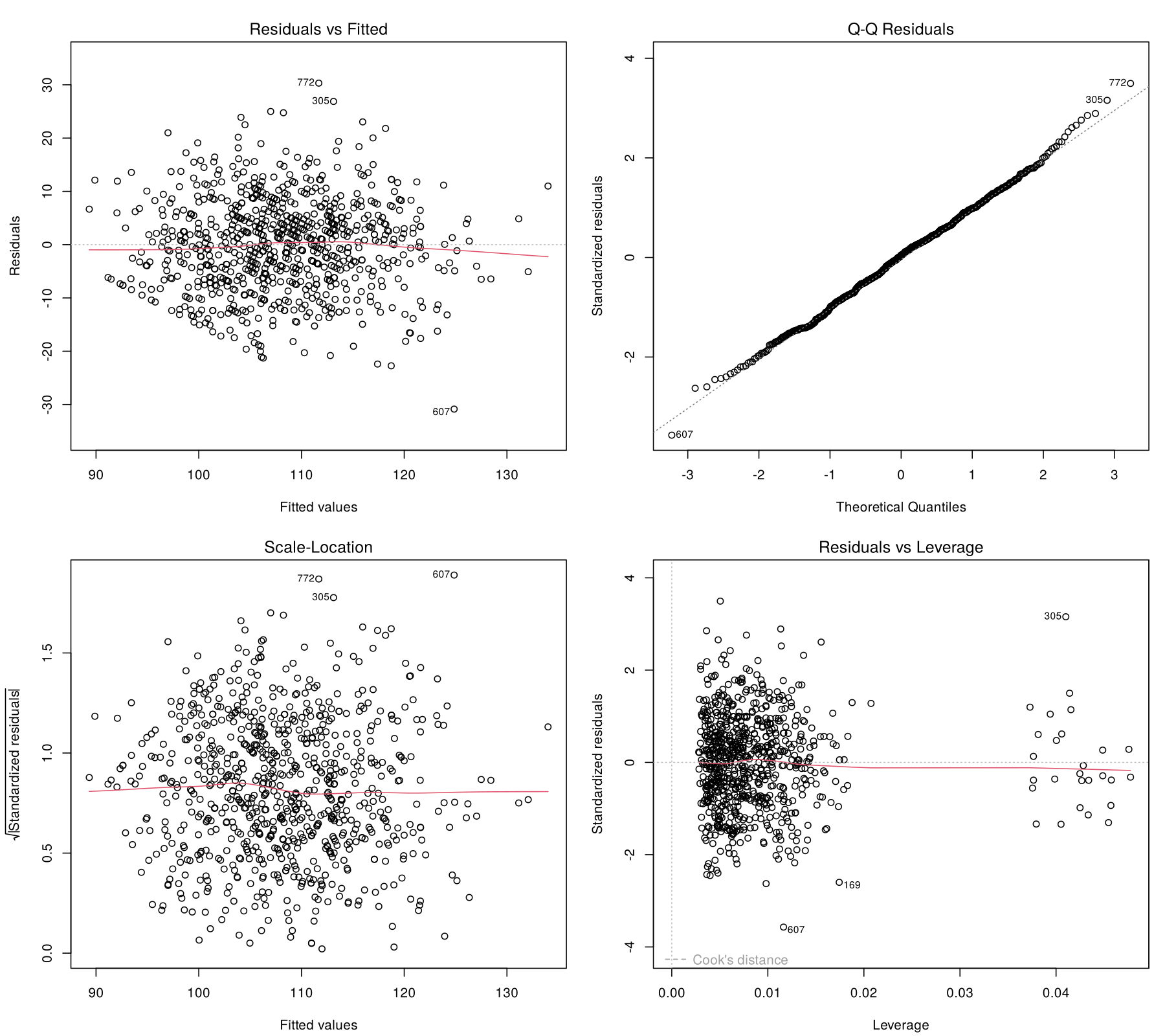
plot(model) for the blood pressure model. Residuals form an even band around zero, the Q-Q points follow the diagonal, the scale-location line is flat, and no point approaches a Cook's distance contour. The vertical cluster at a leverage of about 0.04 is the 27 non-binary participants, whose indicator variable rests on a small group.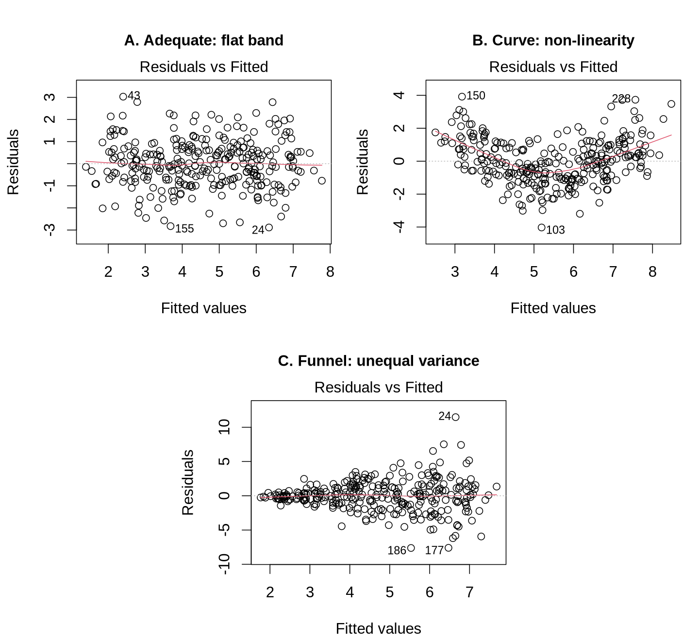
Each point is one observation, placed at its predicted value on the horizontal axis and its residual on the vertical axis. In an adequate model (panel A) the red smoother stays close to the dashed zero line and the vertical spread is similar everywhere. A curved smoother (panel B) means the predictions are systematically too low at both ends and too high in the middle, which is the signature of a non-linear relationship; the response is to model the curve, as described under remedies below. A band that widens from left to right (panel C) means the errors are larger for some fitted values than for others, which is non-constant variance.
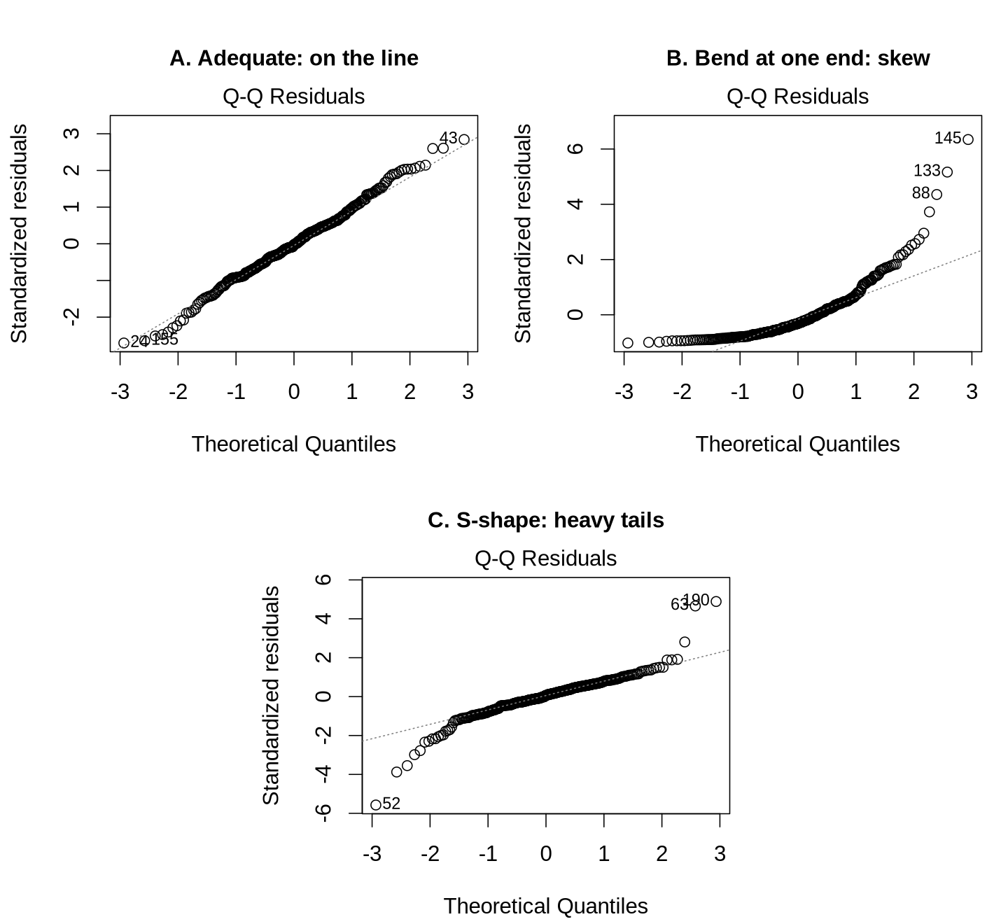
R sorts the standardised residuals from smallest to largest and plots each one against the value expected for its rank if the errors were exactly normal; these expected values are the theoretical quantiles. Normal errors fall along the dashed diagonal. Small wiggles and a few points drifting at the extreme ends occur in any real dataset, as in panel A. A systematic bend at one end (panel B) indicates skewed errors, here a long tail of large positive residuals. An S-shape with both ends pulling away from the line (panel C) indicates heavy tails, meaning more extreme residuals in both directions than a normal distribution would produce.
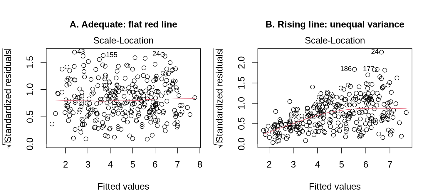
The vertical axis is the square root of the absolute standardised residual, which measures the size of each residual regardless of its sign. A flat red line (panel A) means residuals are of similar size across the range of fitted values. A rising red line (panel B) means residuals grow as the predictions grow, the signature of non-constant variance. This panel often shows the problem more clearly than the Residuals vs Fitted panel, because positive and negative residuals are combined.
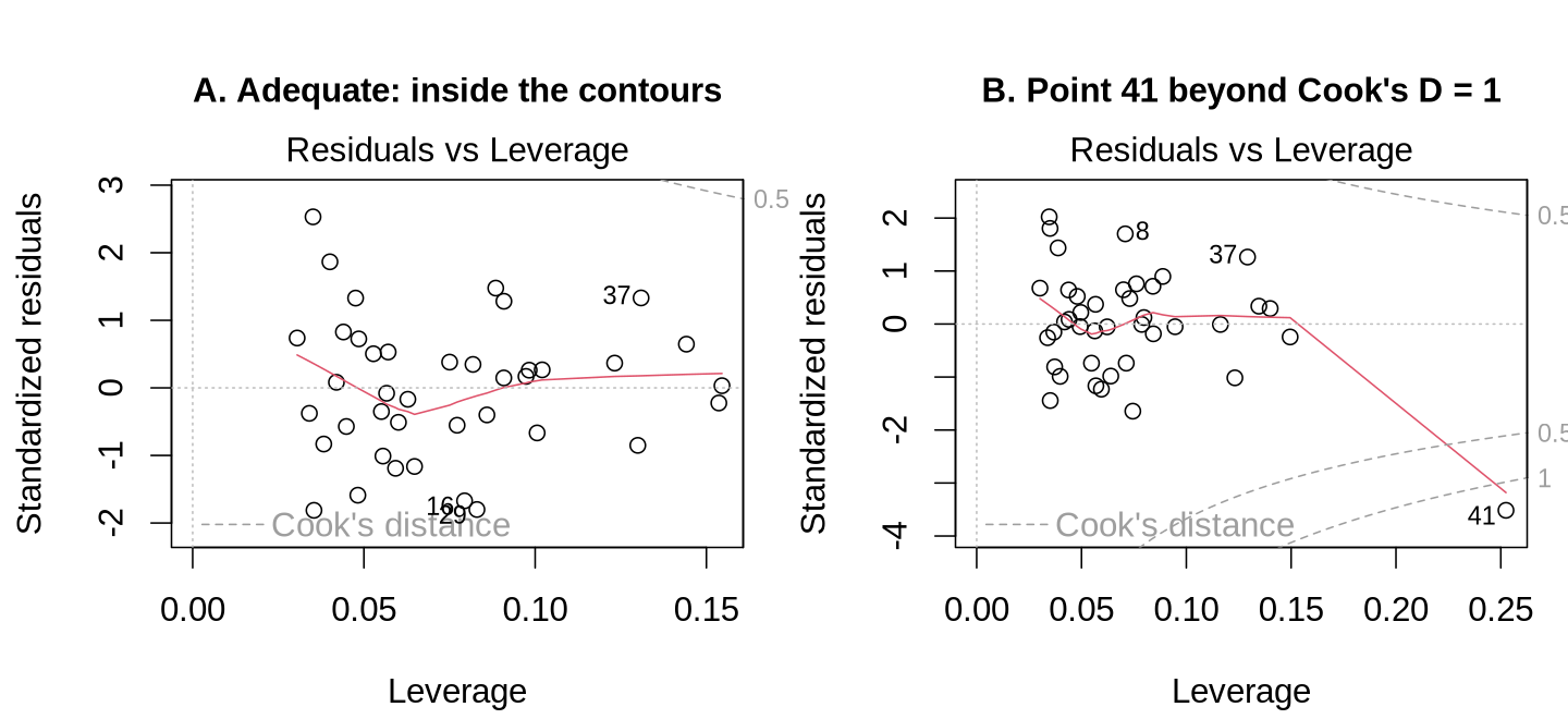
The horizontal axis is leverage, which measures how unusual an observation's combination of predictor values is, and the vertical axis is the standardised residual, which measures how poorly the model predicts it. The dashed grey curves are contours of Cook's distance at 0.5 and 1. Points near the right-hand corners combine high leverage with a large residual and therefore have the greatest influence on the coefficients. In panel A every point lies well inside the contours. In panel B, row 41 has a leverage of 0.25 and a standardised residual of −3.5, which places it beyond the contour of 1 (its Cook's distance is 1.39). Removing that single row moves the slope for x1 from 0.36 to 0.46.
The code below generates every simulated dataset used in this subsection. The numbers in plot(model, which = ) select the panel: 1 for Residuals vs Fitted, 2 for Q-Q Residuals, 3 for Scale-Location and 5 for Residuals vs Leverage.
suppressPackageStartupMessages({library(car); library(lmtest); library(sandwich)})
set.seed(410)
n  <- 300
x1 <- runif(n, 0, 10)
x2 <- rnorm(n)
ok     <- data.frame(x1, x2, y = 2 + 0.5 * x1 + 0.3 * x2 + rnorm(n))
curved <- data.frame(x1, x2, y = 2 + 0.5 * x1 + 0.12 * (x1 - 5)^2 + 0.3 * x2 + rnorm(n))
fan    <- data.frame(x1, x2, y = 2 + 0.5 * x1 + 0.3 * x2 + rnorm(n) * (0.2 + 0.35 * x1))
skew   <- data.frame(x1, x2, y = 2 + 0.5 * x1 + 0.3 * x2 + (rexp(n, 1) - 1) * 1.2)
heavy  <- data.frame(x1, x2, y = 2 + 0.5 * x1 + 0.3 * x2 + rt(n, df = 3) * 0.8)
model_ok     <- lm(y ~ x1 + x2, data = ok)
model_curved <- lm(y ~ x1 + x2, data = curved)
model_fan    <- lm(y ~ x1 + x2, data = fan)
model_skew   <- lm(y ~ x1 + x2, data = skew)
model_heavy  <- lm(y ~ x1 + x2, data = heavy)
set.seed(7)
ni  <- 40
xi  <- runif(ni, 0, 10)
xx2 <- rnorm(ni)
e   <- rnorm(ni)
inf <- data.frame(x1 = c(xi, 16), x2 = c(xx2, 0))
inf$y <- c(2 + 0.5 * xi + 0.3 * xx2 + e, 5)
model_inf <- lm(y ~ x1 + x2, data = inf)par(mfrow = c(1, 3))
plot(model_ok, which = 1); plot(model_curved, which = 1); plot(model_fan, which = 1)
plot(model_ok, which = 2); plot(model_skew, which = 2); plot(model_heavy, which = 2)
par(mfrow = c(1, 2))
plot(model_ok, which = 3); plot(model_fan, which = 3)
plot(lm(y ~ x1 + x2, data = inf[1:40, ]), which = 5); plot(model_inf, which = 5)
par(mfrow = c(1, 1))The formal tests for this model all agree with the plots: the squared age term does not improve the fit (F = 0.43, p = 0.51), the Breusch-Pagan test finds no evidence of unequal variance (BP = 4.68 on 6 df, p = 0.58), and the Shapiro-Wilk test finds no evidence of non-normal residuals (W = 0.998, p = 0.62). The accordion below explains each test and its limits.
The score test in car::ncvTest(model) asks whether the variance of the errors changes with the fitted values, and the studentised Breusch-Pagan test in lmtest::bptest(model) asks whether it changes with any of the predictors (Breusch & Pagan, 1979). A small p-value from either test indicates non-constant variance. The two tests can disagree, because a variance that depends on one predictor but not on the fitted value is detected by the second test and missed by the first.
shapiro.test(residuals(model)) tests the null hypothesis that the residuals come from a normal distribution (Shapiro & Wilk, 1965). Its power grows with the sample size, so in a sample of several hundred it rejects departures too small to affect the coefficient tests, and in a sample of twenty it can miss departures that matter. The same growth in sample size that makes the test oversensitive also brings the protection of the central limit theorem, under which the sampling distribution of each coefficient approaches normality even when the errors are not normal. The Q-Q plot should therefore govern the judgement, with the formal test reported alongside it.
The Residuals vs Fitted panel shows that the functional form is wrong somewhere without showing where. car::crPlots(model) draws one component-plus-residual plot for each continuous predictor. Each plot takes the part of the prediction that comes from that predictor alone (its coefficient multiplied by its values), adds the residuals back to it, and plots the result against the predictor, which shows the shape of that predictor’s relationship with the outcome after the other predictors are taken into account. A curved smoothed line in one of these plots identifies the predictor whose functional form needs attention, and a squared term or a spline for that predictor is the usual response.
Three measures, each with a conventional screening threshold, describe the components of influence. Leverage, from hatvalues(model), flags observations with unusual predictor values, and values above 2p/n, where p is the number of estimated coefficients including the intercept, merit a look. Externally studentised residuals, from rstudent(model), flag outcomes the model predicts poorly, and values beyond about ±3 are unusual, although in a sample of several hundred a handful are expected by chance. Cook’s distance, from cooks.distance(model), combines the two into a single measure of how far the coefficients would move if the observation were removed; values above 0.5 warrant investigation, and values above 1 are generally treated as serious. A threshold of 4/n is also widely quoted, but it is a liberal screen that flags a few per cent of observations in almost any dataset, so it serves to identify rows for inspection. Leverage can arise from a rare category as well as from an extreme numeric value, since every member of a small group has high leverage for that group’s indicator variable. Removing high-leverage rows on the strength of a screen alone can therefore remove an entire small group from the analysis.
Independence is established mainly by knowing how the data were collected. When the rows have a natural order, such as successive weeks of surveillance data, car::durbinWatsonTest(model) tests for correlation between neighbouring residuals. When observations are clustered, no residual test substitutes for recognising the clustering in the design, and the appropriate response is a model that represents it, which a later lesson develops.
A failed check calls for a change to the analysis that matches the cause of the problem. The blood pressure model passed every check, so the examples below use simulated data to show what the problems and their remedies look like.
A failed check is a signal to change the analysis in a way that matches the cause of the problem. The table links the pattern seen in the diagnostics to its usual cause, a first response, and the R code that carries the response out.
| What the diagnostics show | Likely cause | First response | R code |
|---|---|---|---|
A curved smoother in Residuals vs Fitted, or a curved line in crPlots() for one predictor. | A continuous predictor has a curved relationship with the outcome. | Add a squared term or a spline for that predictor and compare the two models. | lm(y ~ x1 + I(x1^2) + x2), then anova(old, new) |
A funnel in Residuals vs Fitted, a rising Scale-Location line, and a small ncvTest p-value. | The spread grows with the mean, which is common for positive, right-skewed outcomes such as costs, lengths of stay and biomarker concentrations. | Model the logarithm of a positive, right-skewed outcome; otherwise keep the model and use heteroscedasticity-consistent (sandwich) standard errors. | lm(log(y) ~ x), or coeftest(model, vcov = vcovHC(model, type = "HC3")) |
| A bend or an S-shape in the Q-Q plot in a small sample. | Skewed or heavy-tailed errors. | Transform the outcome, or obtain confidence intervals by bootstrapping, which resamples the data many times. | lm(log(y) ~ x), or confint( |
| A modest Q-Q departure in a large sample, with the other panels clean. | Mild non-normality. | Usually no change; the coefficient tests remain approximately valid. The check is reported. | None. |
| A point beyond a Cook's distance contour. | An influential observation. | Check the record for an entry error, then fit the model with and without it and report both. | update(model, subset = -41) |
| Residuals forming two parallel bands, because the outcome is 0 or 1. | A binary outcome, for which the linear model is the wrong tool. | Fit a logistic regression, which Section 3 develops. | glm(y ~ x, family = binomial) |
| An outcome that counts events, with variance rising with the mean. | Count data. | Fit a Poisson or negative binomial model, which Lesson 4 develops. | glm(y ~ x, family = poisson) |
| Observations that come in clusters or as repeated measurements. | Non-independence. | Fit a model for clustered data, which Lesson 5 develops. | lme4::lmer(y ~ x + (1 | cluster)) |
Costs, lengths of stay and many biomarker concentrations are positive, right-skewed, and more variable when they are larger. Modelling the logarithm of such an outcome often removes the funnel. The simulated example below behaves in this way.
library(car)   # for ncvTest()
set.seed(411)
x    <- runif(300, 0, 10)
cost <- data.frame(x, y = exp(1 + 0.15 * x + rnorm(300, sd = 0.45)))
model_cost    <- lm(y ~ x, data = cost)        # outcome as measured
model_logcost <- lm(log(y) ~ x, data = cost)   # log-transformed outcome
ncvTest(model_cost)
ncvTest(model_logcost)
coef(model_logcost)
exp(coef(model_logcost)["x"]) # multiplicative change per unit of xThe variance test moves from p = 1.7 × 10⁻¹⁴ to p = 0.55 after the transformation. The coefficient on the log scale, 0.159, is interpreted after exponentiation, the step that reverses the logarithm: exp(0.159) = 1.17, so each one-unit increase in x multiplies the geometric mean of the outcome by 1.17, a 17% increase. The general rule is that a coefficient β for a log-transformed outcome corresponds to a percentage change of 100 × (eβ − 1), where e is the mathematical constant, about 2.718, on which natural logarithms are based. Predictions from such a model, transformed back with exp(), estimate the geometric mean of the outcome, which for a skewed outcome lies close to the median and below the arithmetic mean. A transformation requires an outcome that is always positive; for outcomes with zeros or negative values, sandwich standard errors are the simpler choice.
Sandwich (heteroscedasticity-consistent, HC3) standard errors, from coeftest(model, vcov = vcovHC(model, type = "HC3")) in the lmtest and sandwich packages, recompute the uncertainty of each coefficient without assuming equal variance. The coefficients themselves do not change. For the blood pressure model, the sandwich standard error for smoking is 0.881 mmHg against 0.844 mmHg from summary(), and the other standard errors change by similar small amounts. When the two sets of standard errors agree this closely, the equal-variance assumption is not affecting the conclusions.
This walkthrough fits a linear regression and a logistic regression to the Canadian Social Connection Survey and checks the assumptions of each model, in the order an analyst normally works: explore the variables, fit the model, check it, respond to any problems and interpret the results.
Open the Linear and Logistic Regression in R walkthroughThis activity fits the five-predictor model for systolic blood pressure and reads its output.
phaa <- read.csv("phaa_survey_clean.csv")   # file must be in the working directory
phaa$smoker <- factor(phaa$smoker, levels = c("No", "Yes"))              # "No" = reference
phaa$gender <- factor(phaa$gender, levels = c("Man", "Woman", "Non-binary"))   # "Man" = reference
cc <- na.omit(phaa[, c("systolic_bp", "age", "gender", "smoker", "bmi", "dep_score")])
nrow(cc)                                       # people with complete data for the model
model <- lm(systolic_bp ~ age + gender + smoker + bmi + dep_score, data = cc)
summary(model)Reading the output. The Coefficients table gives each estimate, its standard error, the t value and the p-value. genderWoman and genderNon-binary compare each group with men. The last three lines give the residual standard error (8.696), R² (0.414), adjusted R² (0.409) and the F-test.
round(confint(model), 2) # 95% confidence intervalsUse the questions below to interpret the output you produced. Look at your console output before answering.
1. Report the coefficient for smokerYes with its 95% confidence interval, and write one sentence that explains it, naming the variables it is adjusted for.
2. What is the predicted difference in systolic blood pressure between two people who differ by 10 years of age but are otherwise identical? Show your calculation.
3. Report R², adjusted R² and the residual standard error, and explain what each one tells you about the model.
This activity checks the assumptions of the same model with the four diagnostic plots, three formal tests, Cook's distance, variance inflation factors and sandwich standard errors. Loading the packages prints start-up messages in the console, which are not shown below.
# install.packages(c("lmtest", "car", "sandwich"))   # run once, if not yet installed
library(lmtest); library(car); library(sandwich)
phaa <- read.csv("phaa_survey_clean.csv")   # file must be in the working directory
phaa$smoker <- factor(phaa$smoker, levels = c("No", "Yes"))              # "No" = reference
phaa$gender <- factor(phaa$gender, levels = c("Man", "Woman", "Non-binary"))   # "Man" = reference
cc <- na.omit(phaa[, c("systolic_bp", "age", "gender", "smoker", "bmi", "dep_score")])
nrow(cc)                                       # people with complete data for the model
model <- lm(systolic_bp ~ age + gender + smoker + bmi + dep_score, data = cc)
par(mfrow = c(2, 2)); plot(model); par(mfrow = c(1, 1)) # the four diagnostic plotsThe four plots appear in the Plots pane and match the figure in this section.
model_sq <- lm(systolic_bp ~ age + I(age^2) + gender + smoker + bmi + dep_score, data = cc)
anova(model, model_sq)                         # linearity: does a squared age term help?
bptest(model)                                  # equal spread (Breusch-Pagan test)
shapiro.test(residuals(model)) # normality of the residualscooks <- cooks.distance(model)
sum(cooks > 4 / nrow(cc)) # rows above the 4/n screening line
round(max(cooks), 3) # the largest Cook's distance
vif(model) # collinearity (values near 1 are good)For a categorical predictor with more than one indicator, vif() reports a generalised VIF (GVIF); the last column puts it on the same scale as an ordinary VIF.
# A check that does not rely on equal spread: sandwich (HC3) standard errors
round(coeftest(model, vcov = vcovHC(model, type = "HC3"))[, 1:2], 3)Use the questions below to interpret the output you produced. Look at your console output and plots before answering.
1. Describe what each of the four diagnostic plots shows for this model, and state which assumption each plot checks.
2. Report the results of the squared-age comparison, the Breusch-Pagan test and the Shapiro-Wilk test. Do they agree with the plots?
3. Thirty-five people are above the 4/n line for Cook's distance. Should they be removed? Explain using the largest Cook's distance, and say what the sandwich standard errors add.
1. What does R² (the coefficient of determination) measure?
2. Why is adjusted R² preferred over R² when comparing models with different numbers of predictors?
3. What does the F-test at the bottom of the summary() output of a linear model assess?
4. The Residuals vs Fitted plot of a model shows a funnel that widens from left to right, and the outcome is a positive, right-skewed cost. Which response is most appropriate?
5. A Shapiro-Wilk test on the residuals of a model fitted to 5,000 people gives p = 0.01, but the Q-Q plot shows only a slight bend at one end. What is the best conclusion?
This section showed that R² is the share of the variation in the outcome that the predictors explain (0.41 for the blood pressure model), and that a model is checked with diagnostic plots and formal tests before its results are reported. Consider a regression model you have seen in published research or coursework, or imagine one for an outcome in your field. How would you interpret its R² value? What does a low R², for example 0.05, mean in practice, and does it necessarily indicate a poor model? Which checks would you want to see before trusting its coefficients?
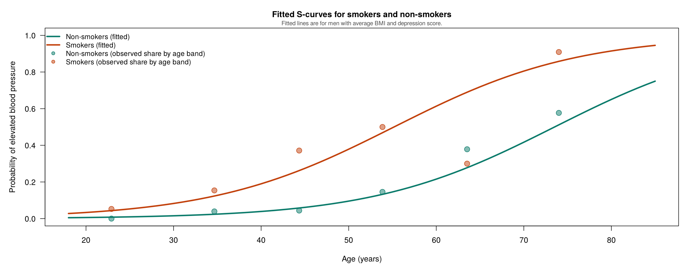
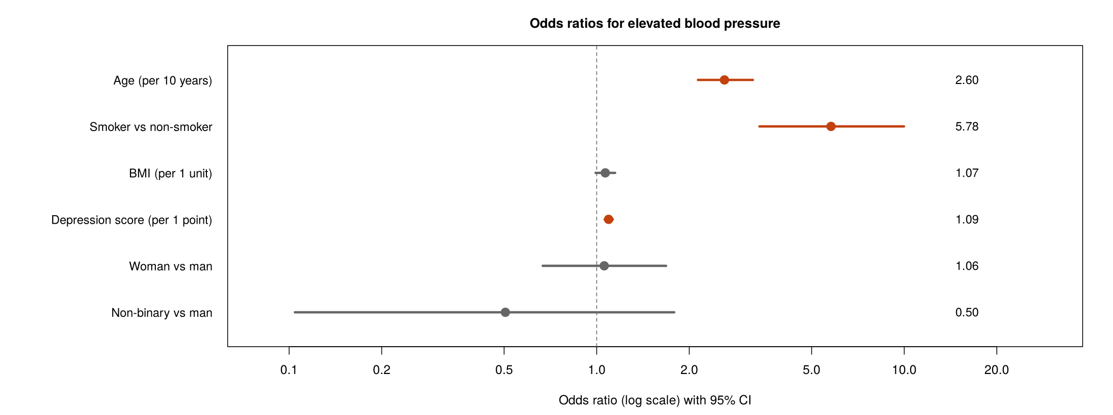
This section models a binary outcome, elevated blood pressure (a systolic reading of 120 mmHg or more), with logistic regression. It uses the same five predictors as Section 2 and the 795 PHAA participants with complete data, of whom 126 have elevated blood pressure.
glm(..., family = binomial) and interpret its exponentiated coefficients as odds ratios.A binary outcome takes only two values, coded 1 for the event (elevated blood pressure) and 0 otherwise. A linear regression fitted to such an outcome can predict values below 0 or above 1, its residuals cannot be normally distributed, and their spread depends on the predicted probability. Logistic regression avoids all three problems.
For an outcome with probability p, the odds are p ÷ (1 − p). A probability of 0.5 corresponds to odds of 1, a probability of 0.2 to odds of 0.25, and a probability of 0.8 to odds of 4. The odds ratio (OR) divides the odds in one group by the odds in another. Among smokers, 48 of 135 have elevated blood pressure (odds 48 ÷ 87 = 0.552), and among non-smokers 80 of 663 do (odds 80 ÷ 583 = 0.137), so the crude odds ratio is 0.552 ÷ 0.137 = 4.02. The log odds, or logit, is the natural logarithm of the odds; it ranges from −∞ to +∞, which allows it to be modelled with a straight line.
Move the sliders to change the intercept (β₀) and slope (β₁). The left panel shows the model on the log-odds scale, where it is a straight line; the symbol η (the Greek letter eta) stands for this straight-line part of the model, β₀ + β₁X, which is often called the linear predictor. The right panel converts the same model into probabilities with the logistic function, written σ (sigma), so that p = σ(η) traces an S-shaped curve that always stays between 0 and 1. The S-curve’s steepness is set by β₁, and its midpoint, the value of X at which the probability equals 0.5, is −β₀/β₁.
The model is fitted with glm(elevated_bp ~ age + gender + smoker + bmi + dep_score, family = binomial, data = cc), where elevated_bp is a factor with levels "No" and "Yes", so that R models the probability of "Yes". The coefficients are on the log-odds scale, and exp(cbind(OR = coef(logit), confint(logit))) turns them into odds ratios with 95% confidence intervals.
| Predictor | Coefficient (log odds) | Odds ratio (95% CI) | Interpretation |
|---|---|---|---|
| Age (per year) | 0.096 | 1.10 (1.08 to 1.12) | Each additional year multiplies the odds by 1.10; over 10 years, the odds ratio is 1.1010 = 2.60. |
| Woman vs man | 0.057 | 1.06 (0.67 to 1.68) | No clear difference. |
| Non-binary vs man | −0.684 | 0.50 (0.10 to 1.79) | Very uncertain, because only 3 of the 27 non-binary participants have elevated blood pressure. |
| Smoker vs non-smoker | 1.754 | 5.78 (3.38 to 9.98) | Smokers have 5.8 times the odds of non-smokers with the same age, gender, BMI and depression score. |
| BMI (per unit) | 0.064 | 1.07 (0.99 to 1.15) | The interval just includes 1 (p = 0.083). |
| Depression score (per point) | 0.089 | 1.09 (1.06 to 1.13) | Each additional point multiplies the odds by 1.09. |
The adjusted odds ratio for smoking (5.78) is larger than the crude odds ratio (4.02 in all 798 people with a reading, and 4.03 in the 795 people with complete data whom the model uses). This change should not be read as evidence of confounding. Smokers and non-smokers in the model have almost the same average age (45.5 and 45.1 years), yet adding age alone raises the odds ratio from 4.03 to 5.28, because an odds ratio changes when strong predictors of the outcome are added to the model, even when they are not confounders. Part of the change also reflects adjustment for BMI, which Section 4 treats as a mediator. The accordion below explains how each type of predictor is interpreted.
For a dichotomous predictor (coded 0/1), the coefficient β represents the log odds ratio comparing the group coded 1 to the group coded 0, adjusted for all other variables. The odds ratio is OR = eβ, where e (about 2.718) is the base of the natural logarithm; raising e to the power β reverses the logarithm and turns the log odds ratio back into an odds ratio. For example, in this section's model βsmoking = 1.754, so OR = e1.754 = 5.78, meaning that the odds of elevated blood pressure are 5.78 times as high for smokers as for comparable non-smokers.
For a continuous predictor, β represents the change in the log odds for each 1-unit increase in the predictor. The OR = eβ gives the multiplicative change in odds per unit increase, that is, the number by which the odds are multiplied each time the predictor rises by one unit; an OR of 1.10 means the odds rise by 10% with each additional unit. To compute the OR for any arbitrary change from x1 to x2:
For example, in this section's model βage = 0.0957, so the OR per 10-year increase in age is e0.0957 × 10 = e0.957 = 2.60.
Categorical predictors with more than two levels are represented using indicator (dummy) variables. One category serves as the baseline/reference, and each coefficient represents the log OR comparing that category to the reference. To judge whether the categorical variable as a whole is associated with the outcome, all of its indicator variables are tested together, using a multi-degree-of-freedom Wald test or an LRT comparing models with and without the entire set of indicator variables. A joint test is needed because each separate coefficient depends on which category was chosen as the reference.
The intercept (β0) represents the logit of the probability of the outcome when all predictors equal zero. On the probability scale, this is: p = 1/(1 + e−β0). The intercept is often not substantively meaningful (e.g., if age = 0 is not a plausible value), but it is essential for computing predicted probabilities. Note that effects on the probability scale are non-linear: the same change in a predictor produces different changes in probability depending on the baseline values of all predictors.
For a 50-year-old man with a BMI of 21 and a depression score of 21, the model predicts a probability of elevated blood pressure of 0.0974 if he does not smoke and 0.3842 if he smokes. The odds are 0.0974 ÷ 0.9026 = 0.108 and 0.3842 ÷ 0.6158 = 0.624, and their ratio is 5.78, the adjusted odds ratio. The ratio of the probabilities, the risk ratio, is 0.3842 ÷ 0.0974 = 3.94. The odds ratio is larger than the risk ratio because elevated blood pressure is common; for an outcome affecting fewer than about 10% of people, the two are similar. Predicted probabilities like these are often the clearest way to explain a logistic model to a general audience.
Logistic regression has its own checks in place of the normality and equal-variance checks of the linear model. The first four parallel the linear model; the last three describe how well the model works as a whole.
| Check | What it asks | How in R | Result for this model |
|---|---|---|---|
| Events per coefficient | Are there enough events (about 10 or more per estimated coefficient)? | table(cc$elevated_bp) | 126 events ÷ 6 coefficients ≈ 21 |
| Linearity on the log-odds scale | Does a continuous predictor need a curve? | Add a squared term; anova(..., test = "Chisq") | Squared age: p = 0.43 |
| Collinearity | Are the predictors too strongly correlated? | vif() | All below 1.14 |
| Influence | Does any observation change the results much? | cooks.distance() | Largest value 0.065 |
| Overall fit | Do the predictors improve on a model with none? | Likelihood ratio test against glm(y ~ 1) | Deviance drop 199.4 on 6 df, p < 0.001 |
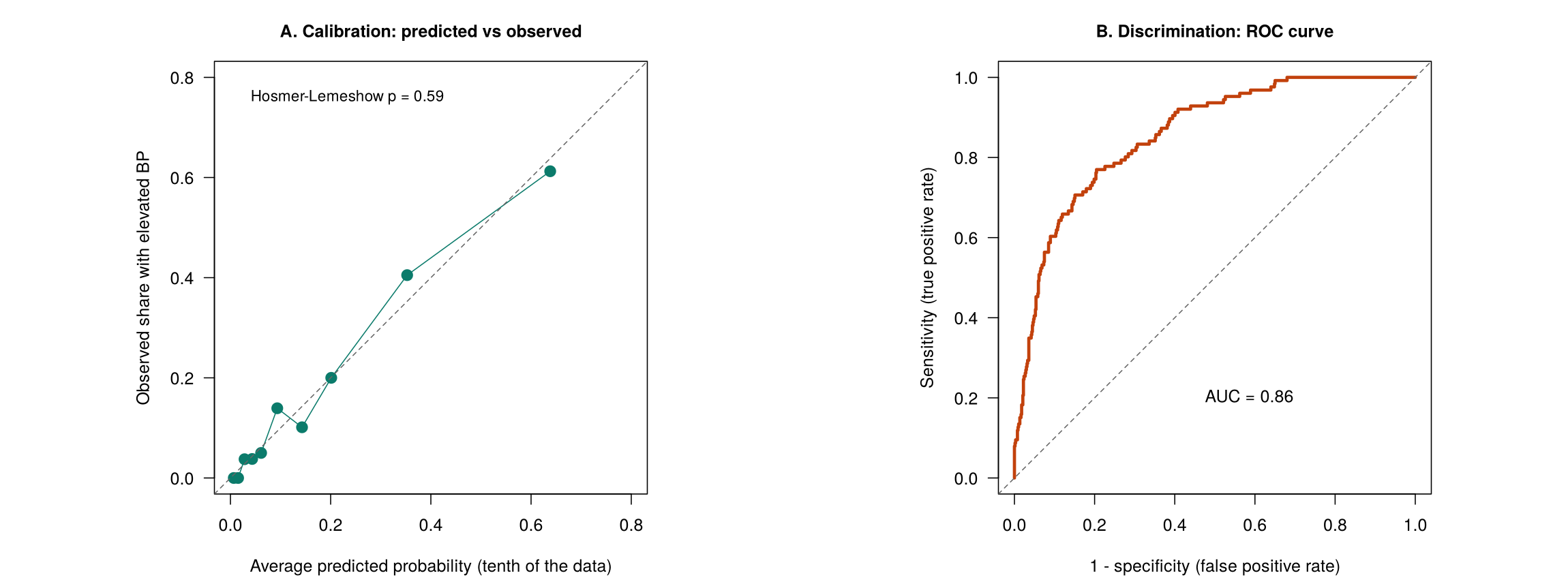
| Calibration | Do predicted probabilities match observed shares? | ResourceSelection::hoslem.test() | χ² = 6.50 on 8 df, p = 0.59 |
| Discrimination | Does the model separate people with and without the outcome? | pROC::auc() | AUC = 0.86 |
The deviance measures how far a model is from fitting the data perfectly, and the likelihood ratio test compares the deviance of two nested models; here the deviance falls from 695.1 for the model with no predictors to 495.6 for the full model. McFadden's pseudo-R², 1 − 495.6 ÷ 695.1 = 0.29, summarises the improvement on a scale from 0 to 1, but it is not the share of variance explained and is usually much lower than R² from a linear model. The Hosmer-Lemeshow test, like other formal tests, becomes very sensitive in large samples, so the calibration plot is read alongside it.
With too few events per coefficient, logistic regression estimates become unstable and their confidence intervals very wide. The survey's hypertension variable, with 23 cases, would support only about two predictors. A related problem, called separation, occurs when a predictor category has no events at all, or only events; the estimate for that category then grows without limit. The non-binary group, with 3 events among 27 people, shows the milder version of this problem: its odds ratio of 0.50 has a confidence interval from 0.10 to 1.79.
This activity creates the elevated blood pressure outcome, fits the logistic model, and turns its coefficients into odds ratios and predicted probabilities.
phaa <- read.csv("phaa_survey_clean.csv")   # file must be in the working directory
phaa$smoker <- factor(phaa$smoker, levels = c("No", "Yes"))              # "No" = reference
phaa$gender <- factor(phaa$gender, levels = c("Man", "Woman", "Non-binary"))   # "Man" = reference
phaa$elevated_bp <- factor(ifelse(phaa$systolic_bp >= 120, "Yes", "No"),
                           levels = c("No", "Yes"))   # "Yes" (120 mmHg or more) is the event
table(phaa$hypertension)                       # the original hypertension variable
table(phaa$elevated_bp) # the outcome used in this sectioncc <- na.omit(phaa[, c("elevated_bp", "age", "gender", "smoker", "bmi", "dep_score")])
logit <- glm(elevated_bp ~ age + gender + smoker + bmi + dep_score,
family = binomial, data = cc)
summary(logit)Reading the output. The Estimate column is on the log-odds scale, and z value and Pr(>|z|) give a Wald test for each coefficient. The null and residual deviances are used for the likelihood ratio test in the next activity.
round(exp(cbind(OR = coef(logit), confint(logit))), 3)   # odds ratios with 95% CIs
round(exp(10 * coef(logit)[["age"]]), 2) # odds ratio for 10 years of ageconfint() on a glm computes profile-likelihood intervals, so R prints "Waiting for profiling to be done..." first.
two_people <- data.frame(age = 50, gender = "Man", smoker = c("No", "Yes"),
                         bmi = 21, dep_score = 21)   # same age, BMI and depression score
round(predict(logit, newdata = two_people, type = "response"), 3) # predicted probabilitiesUse the questions below to interpret the output you produced. Look at your console output before answering.
1. Report the odds ratio for smoking with its 95% confidence interval and write one sentence that explains it.
2. Report the odds ratio for one year and for ten years of age, and explain how the ten-year value is calculated.
3. Report the two predicted probabilities and explain why their ratio differs from the odds ratio for smoking.
This activity checks the logistic model with a likelihood ratio test, a test for a curved age effect, the Hosmer-Lemeshow test, McFadden's pseudo-R² and the ROC curve. Loading the packages prints start-up messages in the console, which are not shown below.
# install.packages(c("ResourceSelection", "pROC"))   # run once, if not yet installed
library(ResourceSelection); library(pROC)
phaa <- read.csv("phaa_survey_clean.csv")   # file must be in the working directory
phaa$smoker <- factor(phaa$smoker, levels = c("No", "Yes"))              # "No" = reference
phaa$gender <- factor(phaa$gender, levels = c("Man", "Woman", "Non-binary"))   # "Man" = reference
phaa$elevated_bp <- factor(ifelse(phaa$systolic_bp >= 120, "Yes", "No"),
                           levels = c("No", "Yes"))   # "Yes" (120 mmHg or more) is the event
cc <- na.omit(phaa[, c("elevated_bp", "age", "gender", "smoker", "bmi", "dep_score")])
logit <- glm(elevated_bp ~ age + gender + smoker + bmi + dep_score,
             family = binomial, data = cc)
null_model <- glm(elevated_bp ~ 1, family = binomial, data = cc)
anova(null_model, logit, test = "Chisq") # does the model beat no predictors at all?logit_sq <- update(logit, . ~ . + I(age^2))
anova(logit, logit_sq, test = "Chisq") # linearity on the log-odds scalehoslem.test(as.numeric(cc$elevated_bp == "Yes"), fitted(logit), g = 10) # calibration
round(1 - logit$deviance / logit$null.deviance, 3) # McFadden pseudo R-squaredThe outcome is given to hoslem.test() as 0 and 1, because the test does not accept a factor.
roc_model <- roc(cc$elevated_bp, fitted(logit), levels = c("No", "Yes"), direction = "<")
auc(roc_model)                                 # discrimination: area under the ROC curve
plot(roc_model, legacy.axes = TRUE) # x-axis shows 1 - specificitylegacy.axes = TRUE labels the horizontal axis as 1 − specificity, running from 0 to 1.
Use the questions below to interpret the output you produced. Look at your console output and plots before answering.
1. Report the likelihood ratio test against the model with no predictors and explain what it shows.
2. Does age need a curved term on the log-odds scale? Report the test and your conclusion.
3. Report the Hosmer-Lemeshow test and the AUC, and explain the difference between calibration and discrimination.
1. What does the logit function transform?
2. In a logistic regression, how is the odds ratio for a predictor computed from its coefficient?
3. For a continuous predictor, what does the odds ratio represent?
4. What does the Hosmer-Lemeshow test evaluate?
5. What does an area under the ROC curve (AUC) of 0.5 indicate?
This section checked a logistic model in two ways that answer different questions. Calibration asks whether the predicted probabilities agree with the observed outcomes, and it is assessed with the Hosmer-Lemeshow test and a calibration plot. Discrimination asks how well the model separates people with and without the outcome, and it is assessed with the area under the ROC curve. Think of a yes-or-no health outcome in your field and a logistic model that could be built for it. Which predictors would you include? Why might a model have good discrimination but poor calibration, or the reverse, and which of the two would matter more if the model were used to tell individual patients their risk?
This section describes how to decide which variables enter a regression model and how to compare models. It uses the PHAA survey with systolic blood pressure as the outcome and smoking as the exposure of interest, and every comparison uses the 748 participants with complete data for twelve candidate variables.
A model built to explain estimates the effect of an exposure on an outcome; its variables are chosen to remove confounding, and its coefficients are interpreted. A model built to predict forecasts the outcome for new people; its variables are chosen for accuracy, and its individual coefficients matter less. The cards below summarise the two goals and the principle of parsimony, which applies to both.
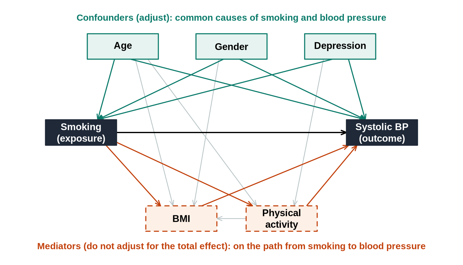
For an explanatory question, the variables are chosen before the results are seen, from subject-matter knowledge expressed as a causal diagram (also called a directed acyclic graph, or DAG). Each arrow is an assumed causal effect. A confounder has arrows to both the exposure and the outcome and is included in the model. A mediator lies on a path from the exposure to the outcome and is left out when the total effect of the exposure is of interest, because adjusting for it removes the part of the effect that travels through it.
The steps below describe the full model-building process, from specifying the largest model worth considering to presenting the result.
Identify the outcome variable and determine whether it needs transformation (e.g., natural log). Then identify the full set of predictors to consider. The maximum model includes all possible predictors of interest. While a large model prevents overlooking important predictors, adding too many increases the risks of collinearity and spurious associations. Key sub-steps include: drawing a causal diagram, potentially reducing predictors, considering missing values, evaluating effects of continuous predictors, and deciding on interaction terms. Section 2 describes how to decide whether the outcome needs a transformation.
Decide how you will determine which variables to retain. Criteria can be non-statistical (e.g., is it a primary predictor of interest? Is it a known confounder?) or statistical (e.g., partial F-tests, likelihood-ratio tests, information criteria like AIC or BIC). Both types of criteria should be considered together.
Choose how to apply the criteria. Options include: examining all possible subsets, forward selection (adding variables one at a time), backward elimination (starting with all variables and removing), or stepwise procedures (combining forward and backward). The strategy determines the order in which variables are evaluated. For a causal question these strategies are not used to choose confounders; the box on the limits of automatic selection later in this section explains why.
Step 4: Conduct the analyses using your chosen strategy and criteria. Step 5: Evaluate the reliability of the chosen model using diagnostics and sensitivity analyses. Step 6: Present the results in a meaningful way, ensuring they are interpretable to your audience and that the model-building process is transparent. The end of this section lists what a report of the final model includes.
Every estimated coefficient uses up information. A common guide asks for at least 10 to 20 observations per coefficient in a linear model and at least 10 events per coefficient in a logistic model. A categorical predictor with k categories uses k − 1 coefficients. When a model has too many terms for its data, it starts to fit the random noise of its sample, which is called overfitting: its R² looks excellent, but its predictions for new people are poor. The simulator below shows the pattern.
The simulator fits curves of increasing flexibility (polynomial degree) to a small sample and then tests them on new data from the same population. The fit to the sample always improves as the degree rises, but the error on the new data falls only up to a point and then rises. The best model for new data is the one at the bottom of that U shape.
Fit polynomials of increasing degree to a small training sample, then evaluate on a fresh hold-out sample drawn from the same true relationship. In-sample R², the fit to the training data, always rises as the curve becomes more flexible. Out-of-sample error, the error on the fresh hold-out points, first falls and then rises, forming a U shape. The degree at the bottom of the U gives the best predictions for new data.
Models are compared only when they are fitted to the same observations. Because different predictors have different missing values, the safest approach is to create one complete-case data set for all candidate variables first, as the R activity does with na.omit(). The tabs below describe the main criteria.
Variables should be retained in the model if they:
A fourth, data-based check is often listed with these: a variable is kept if removing it changes the coefficient of interest substantially, often by more than 10% (the change-in-estimate criterion). This check uses the data, so it is a statistical criterion, and it cannot tell a confounder from a mediator, because removing a mediator also changes the coefficient of the exposure. It is therefore applied only to variables that the causal diagram already identifies as possible confounders, as a way of deciding whether a weak confounder can be dropped to gain precision.
Models where one model’s predictors are a subset of another’s are called nested models. Tests for nested models include:
For a categorical variable entered as several indicator terms, the overall significance of all its indicators is tested together in one test. The indicators together represent one variable, and the p-value of each separate indicator depends on which category was chosen as the reference.
In plain terms, each of these tests asks the same question: do the extra terms in the larger model explain enough additional variation to be worth the degrees of freedom they cost? A small p-value says yes.
For non-nested models, information criteria are used. The general formula is:
Where s is the number of parameters, lnL is the log-likelihood, and a is a penalty constant. For AIC, a = 2 (Akaike, 1974). For BIC, a = ln(n) (Schwarz, 1978). Smaller values indicate a better model. Because ln(n) is larger than 2 whenever n is 8 or more, BIC charges more than AIC for each extra parameter and so tends to favour more parsimonious models, that is, models with fewer terms.
Reading the numbers. An AIC or BIC value means nothing on its own; a single value such as 1,240 is neither good nor bad. Only the difference between models carries information, and the comparison is valid only when the models are fit to the same outcome, measured the same way, on the same set of observations. That last condition catches beginners: you cannot compare the AIC of a model for Y against one for log(Y), and quietly dropping rows with missing values changes the sample, which makes the criteria incomparable.
Guidelines for interpreting BIC differences between models:
For AIC, a widely used rule of thumb reads the difference between each model and the model with the lowest AIC: a difference of 2 or less means the model still has substantial support, a difference of 4 to 7 means considerably less support, and a difference of more than 10 means essentially none (Burnham & Anderson, 2004).
For the PHAA example in this section, the model with BMI and physical activity has an AIC 15.0 lower (5374.7 against 5389.7) and a BIC 5.8 lower (5416.3 against 5422.1) than the model without them. Both criteria therefore favour the larger model, AIC strongly and BIC positively, in line with the partial F-test (F = 9.54, p < 0.001). R counts the error variance as one of the parameters, so a linear model with six coefficients has s = 7, which AIC() prints as df.
Adjusted R² is R² with a deduction for each predictor in the model, so it rises when a new predictor improves the fit by more than a predictor of pure noise would be expected to, and falls otherwise. The model with the highest adjusted R² is preferred. Mallows’ Cp, described below, measures the same balance between fit and complexity, and lower values are better.
Here the sum of squares is taken over the candidate model; p is the number of parameters in the candidate model, counting the intercept, so a model with three predictors has p = 4; σ² is the mean squared error of the full model containing every candidate predictor; and n is the sample size. For the full model itself, Cp equals p by construction. Mallows’ Cp is closely related to AIC: when the error variance is treated as known and taken from the full model, the two differ only by a constant and rank candidate models in the same order. The decision rule used in this course is to prefer the candidate model with the lowest Cp.
The smaller model contains age, gender, smoking and depression; the larger model adds BMI and physical activity. The partial F-test from anova(m_small, m_large) gives F = 9.54 on 2 and 740 degrees of freedom (p = 8.1 × 10⁻⁵), adjusted R² rises from 0.382 to 0.396, AIC falls by 15.0 (from 5389.7 to 5374.7) and BIC falls by 5.8 (from 5422.1 to 5416.3). Every statistical criterion favours the larger model. The next worked example shows why that does not settle which model answers the question about smoking.
When many candidate variables are available, selection strategies apply a criterion such as AIC or a p-value threshold automatically.
In R, step(m_full, direction = "backward") performs backward elimination by AIC. Starting from all 11 candidate predictors (age, gender, smoking, depression, BMI, physical activity, anxiety, social support, discrimination, education and region), it keeps age, smoking, depression, BMI and physical activity. AIC-based elimination keeps any term whose removal would raise AIC, which corresponds roughly to keeping terms with a p-value below about 0.16, so physical activity (p = 0.14 in the full model) is retained. Gender is dropped, although the causal diagram treats it as a confounder.
Automatic strategies choose variables by how well they fit the sample, so they cannot distinguish a confounder from a mediator, they can drop a confounder that adds little to the fit, and they can keep a mediator that predicts the outcome well. The p-values and confidence intervals of the selected model are also too optimistic, because the same data were used to choose the model and to test it. For an explanatory question, the causal diagram decides which variables are included; automatic selection is better suited to prediction or to exploring a large set of candidates.
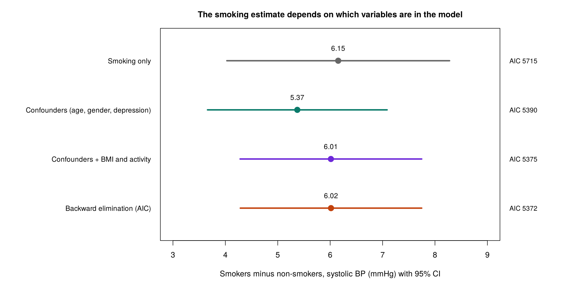
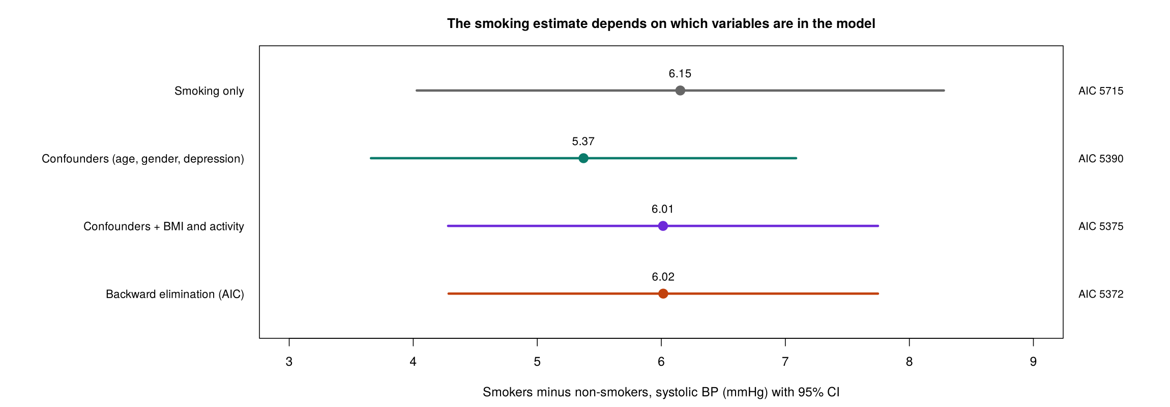
| Model | Smoking estimate (mmHg) | 95% CI | AIC | What it estimates |
|---|---|---|---|---|
| Smoking only | 6.15 | 4.03 to 8.28 | 5714.9 | The crude difference, affected by any confounding. |
| Confounders from the causal diagram (age, gender, depression) | 5.37 | 3.66 to 7.09 | 5389.7 | The total effect of smoking, if the diagram is correct. |
| Confounders + BMI and physical activity | 6.01 | 4.28 to 7.75 | 5374.7 | The effect of smoking other than through BMI and activity. |
| Backward elimination by AIC | 6.02 | 4.29 to 7.75 | 5371.7 | A mixture chosen by fit, which drops gender and keeps the mediators. |
The models with the mediators have the lower AIC, mainly because BMI predicts blood pressure well. In these data, smokers have a lower average BMI (19.3 against 21.1 among these 748 people), so part of the effect of smoking on blood pressure is counteracted through BMI, and adjusting for BMI removes that counteracting path and raises the smoking estimate. For the question "how much higher is blood pressure because of smoking?", the confounder model, with an estimate of 5.37 mmHg, is the appropriate one. Fit statistics then help to choose among models that answer the same question, for example a straight-line term for age against a curved one.
An interaction (effect modification) is present when the effect of one predictor depends on the value of another. In R, age * smoker adds age, smoking and their product age:smoker. Comparing lm(systolic_bp ~ age * smoker + gender + dep_score) with the model without the product gives F = 1.08 on 1 and 741 df (p = 0.30), so there is no evidence that the effect of smoking changes with age, and the simpler model is kept. An interaction term is always fitted with both of its main effects, and the interactions to test are best chosen in advance; the accordion below lists common strategies, of which the theory-driven ones are preferred.
This is feasible only when the total number of predictors is small (e.g., ≤ 8). You create and test every possible pair of interaction terms.
After building the final main-effects model, create interactions among all predictors that are statistically significant. This reduces the number of interactions to evaluate but may miss interactions with non-significant main effects.
Create interactions among all predictors that have a significant unconditional association with the outcome. This casts a wider net than Strategy 2.
Only create interactions among pairs of variables you suspect (based on evidence from the literature or biological reasoning) might interact. This usually focuses on interactions involving the primary predictor(s) of interest and important confounders.
Only create interactions that involve the exposure variable (primary predictor of interest). This is the most conservative approach but may miss important interactions among covariates.
A report of a regression model states the goal of the analysis and how the variables were chosen (with the causal diagram, if one was used), the number of people analysed out of the number available, each estimate on its own scale (a difference in means for a linear model, an odds ratio for a logistic model) with its 95% confidence interval, the checks that were carried out and their results, and any sensitivity analyses, such as the same model with an alternative set of variables.
This walkthrough compares nested regression models with F-tests, adjusted R-squared, the AIC and the BIC, keeping the same people in every model, and then shows backward elimination and forward selection with their limitations.
Open the Comparing Models and Selecting Variables in R walkthroughThis activity creates one complete-case data set for twelve candidate variables, compares two nested models, runs backward elimination and tests an interaction.
phaa <- read.csv("phaa_survey_clean.csv")   # file must be in the working directory
phaa$smoker <- factor(phaa$smoker, levels = c("No", "Yes"))              # "No" = reference
phaa$gender <- factor(phaa$gender, levels = c("Man", "Woman", "Non-binary"))   # "Man" = reference
vars <- c("systolic_bp", "age", "gender", "smoker", "dep_score", "bmi", "phys_act_min",
          "anx_score", "social_support_score", "discrimination_score", "education", "region")
build <- na.omit(phaa[, vars])                 # the same people for every model compared
nrow(build)Every model below uses these 748 people, so their AIC and BIC values can be compared.
m_small <- lm(systolic_bp ~ age + gender + smoker + dep_score, data = build)
m_large <- lm(systolic_bp ~ age + gender + smoker + dep_score + bmi + phys_act_min, data = build)
anova(m_small, m_large)                       # nested F-test: do the added terms help?
round(c(adjR2_small = summary(m_small)$adj.r.squared,
        adjR2_large = summary(m_large)$adj.r.squared), 3)
AIC(m_small, m_large)                         # lower AIC is better
BIC(m_small, m_large) # BIC penalises extra terms morem_full <- lm(systolic_bp ~ ., data = build) # every candidate predictor
m_back <- step(m_full, direction = "backward", trace = 0) # backward elimination by AIC
formula(m_back)systolic_bp ~ . means "systolic blood pressure on every other column of build". trace = 0 hides the step-by-step printout; trace = 1 shows each step.
m_int <- lm(systolic_bp ~ age * smoker + gender + dep_score, data = build)   # age:smoker added
anova(m_small, m_int) # does the smoking effect differ by age?Use the questions below to interpret the output you produced. Look at your console output before answering.
1. Report the partial F-test, the two adjusted R² values and the AIC and BIC differences for m_small and m_large. Which model does each criterion favour?
m_large (5374.7 against 5389.7) and BIC is 5.8 lower (5416.3 against 5422.1). Every criterion favours m_large, the model with BMI and physical activity.2. Which variables did backward elimination keep, and why might the result be a poor choice for estimating the total effect of smoking?
3. Report the test of the age:smoker interaction and state your conclusion. Why is the interaction tested by comparing two models?
m_small gives F = 1.08 on 1 and 741 df (p = 0.30), so there is no evidence that the effect of smoking on blood pressure depends on age, and the model without the interaction is kept. The comparison isolates the contribution of the product term, because the two models differ only by age:smoker and both are fitted to the same 748 people.1. When the goal of a regression model is to understand causal relationships, which of the following is true?
2. In a study of cigarette smoking’s effect on birth weight, why should gestation length generally not be included in the model?
3. What is the key difference between AIC and BIC?
4. Why is backward elimination often considered better than forward selection for finding predictors?
5. If an interaction term between variables A and B is included in a regression model, which of the following must also be true?
This section compared two ways of choosing the variables in a model. Statistical criteria such as AIC and BIC choose the model that best balances fit against the number of terms, and stepwise methods add or remove predictors according to their statistical contribution. Subject-matter knowledge, expressed through a causal diagram, instead decides which variables must be in the model because of their causal role. In the worked example, the model with the lowest AIC included BMI and physical activity, which the causal diagram treats as mediators, and it estimated a smoking effect of 6.0 mmHg against 5.4 mmHg from the confounder model. Reflect on the tension between the two approaches. Why might a model selected purely by statistical criteria fail to answer a research question about the effect of an exposure, and where do AIC and BIC remain useful?
This lesson moved from comparing two variables to building and comparing regression models. Section 1 matched each pair of variable types to a two-variable test, listed the rank-based and exact alternatives used when an outcome is skewed or ordinal or when counts are small, applied the correlation coefficient, the t-test, ANOVA and the chi-square test to the PHAA survey, and showed with physical activity and blood pressure that a two-variable comparison can be distorted by confounding: the difference of 2.8 mmHg per 100 minutes of activity fell to 0.9 mmHg once age was taken into account. It then introduced the regression line, least squares and the multivariable model, in which each coefficient is adjusted for the other predictors, and showed that the t-test is a regression with one binary predictor.
Section 2 fitted a linear regression for systolic blood pressure with five predictors, in which smokers averaged 6.1 mmHg higher than comparable non-smokers and the model explained 41% of the variation. The model passed each check: the four diagnostic plots, a squared age term, the Breusch-Pagan and Shapiro-Wilk tests, Cook's distance and variance inflation factors. The section also described the standard responses when a check fails, such as a squared term, a log transformation or sandwich standard errors. Section 3 modelled elevated blood pressure with logistic regression, in which smokers had 5.8 times the odds of comparable non-smokers, explained odds, log odds and predicted probabilities, and checked the model for events per coefficient, linearity on the log-odds scale, calibration (Hosmer-Lemeshow p = 0.59) and discrimination (AUC = 0.86). Section 4 showed that the choice of variables starts from the goal of the analysis and, for an explanatory question, from a causal diagram; that models are compared on the same people with F-tests, likelihood ratio tests, AIC and BIC; and that the best-fitting model, which included two mediators of smoking, was not the right model for estimating the total effect of smoking.
The final assessment covers all four sections. All 15 questions must be answered correctly (100%), and the final reflection completed, to finish the lesson.
A cohort study has measured systolic blood pressure (continuous) and a diagnosis of hypertension (yes or no) in 2,400 adults, of whom 360 have hypertension. The exposure of interest is regular alcohol use. The data also include age, gender, income and family history of hypertension, which are plausible confounders, body weight, which may lie on the causal path from alcohol use to blood pressure, and a dozen other variables. This lesson showed that two-variable tests can be confounded, that a linear regression gives adjusted differences in the average outcome and is checked with diagnostic plots, that a logistic regression gives adjusted odds ratios and is checked for events per coefficient, calibration and discrimination, and that the variables for an explanatory question are chosen from a causal diagram, with models compared on the same people. Describe how you would build, fit, check and report a model for each outcome: which variables you would include and why, how you would interpret the main coefficient of each model, which checks you would run, and how you would use model comparison.
lm(sbp ~ alcohol + age + gender + income + family_history); the alcohol coefficient is the adjusted difference in average systolic blood pressure between regular drinkers and others, reported with its 95% confidence interval. The checks would include the four diagnostic plots, a squared age term, the Breusch-Pagan and Shapiro-Wilk tests (which, with 2,400 people, can flag trivial departures), Cook's distance and VIFs; a funnel would lead to sandwich standard errors or a transformation. For hypertension, 360 events support about 36 coefficients, so the same five predictors are well within the guide. The model would be glm(hypertension ~ alcohol + age + gender + income + family_history, family = binomial), and the exponentiated alcohol coefficient would be reported as an adjusted odds ratio with its confidence interval, together with predicted probabilities for typical people, because hypertension is common (15%) and the odds ratio will exaggerate the risk ratio. The checks would include linearity of age on the log-odds scale with a likelihood ratio test, the Hosmer-Lemeshow test with a calibration plot, and the AUC. F-tests, likelihood ratio tests and AIC would be used only to compare versions of the models that answer the same question, such as a straight-line against a curved age term; the confounders come from the causal diagram. The report would state the causal diagram, the number analysed, both estimates on their own scales with confidence intervals, the checks and their results, and the sensitivity analysis with body weight.Minimum 20 characters required.
1. Which test compares mean systolic blood pressure across five regions?
2. A regression of systolic blood pressure on smoking (coded No or Yes) gives a slope of 6.3 mmHg. What does the slope equal?
3. In a multivariable model, β1 represents the effect of X1 on Y:
4. To code a nominal variable with 5 categories for regression, you would create:
5. A VIF of 1.0 for a predictor indicates that:
6. A model for a positive, right-skewed outcome is fitted on the log scale, and a predictor has a coefficient of 0.10. What does this mean?
7. Why is categorising a continuous predictor, or outcome, generally not advisable?
8. Including an intervening variable in a causal regression model will:
9. Why can't linear regression be used for dichotomous outcomes?
10. For a continuous predictor in a logistic model, the odds ratio for a change from x1 to x2 is:
11. The minimum sample size guide for logistic regression suggests:
12. An ROC curve that closely follows the 45° diagonal indicates:
13. What is the purpose of drawing a causal diagram before model building?
14. Two linear models are fitted to the same outcome, but one uses 790 people and the other 748 because of missing values. Can their AIC values be compared?
15. Which of the following is NOT a non-statistical reason to retain a variable in the model?
✦ Before submitting: pass every section knowledge check (100%) and complete every reflection.